Sagely Naturals core re-design
Original design
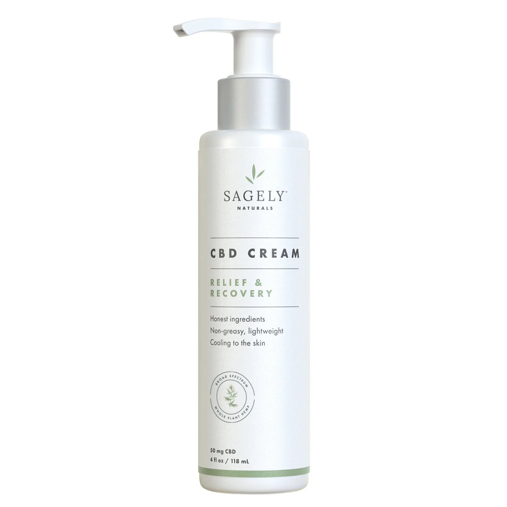
Sagely Natural’s original design was really inspired by prescription bottles with the all white packaging, thin keylines to segment information, and the silver clinical collar. When I joined Sagely Naturals as their Creative Art Director, the delicate design on white packaging receded on shelf in comparison to their competitors with big bold graphics or colors which trickled down into their 360 look and feel lacking color as well. I recommended evolving the brand to be more powerful.
New look & feel
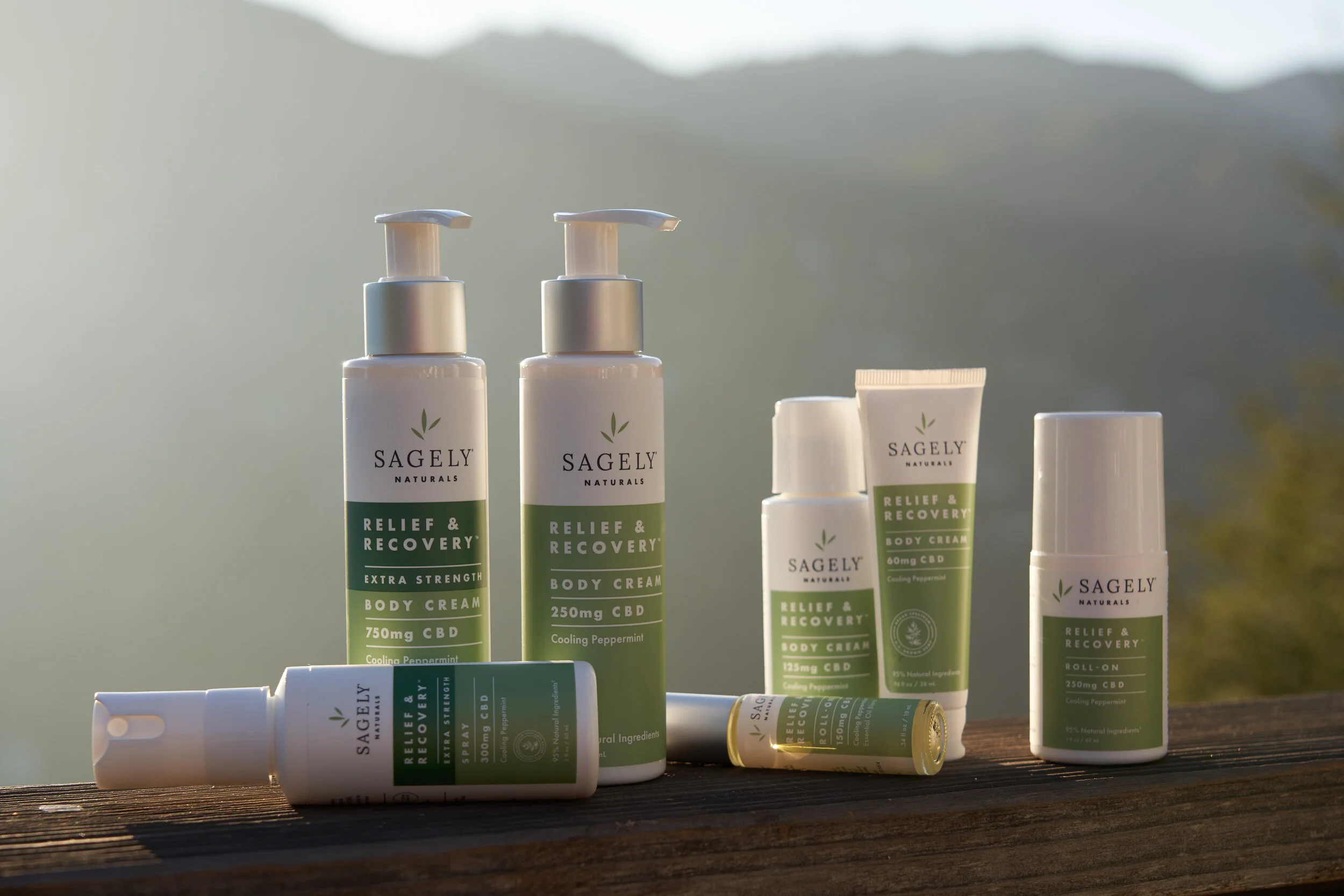
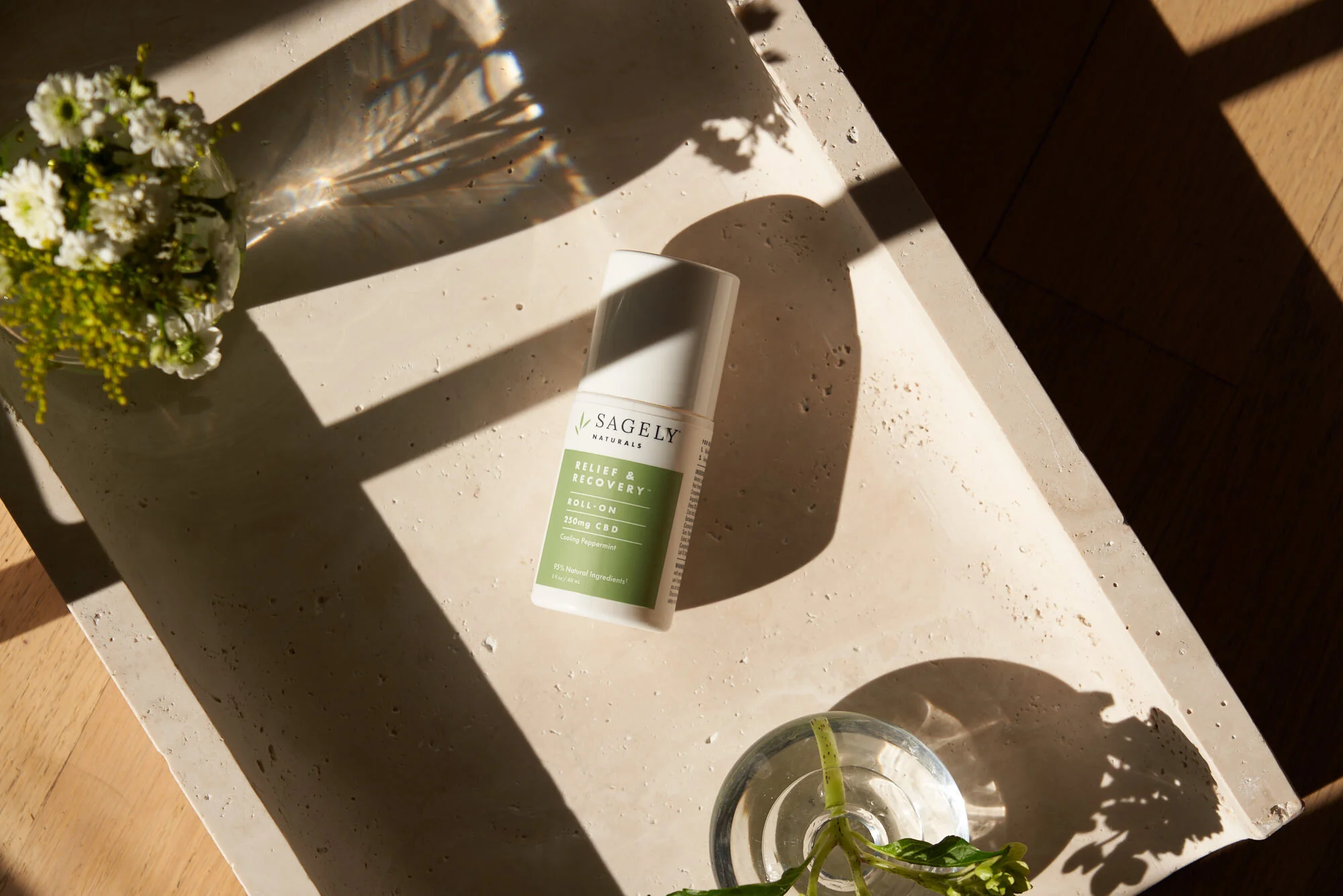
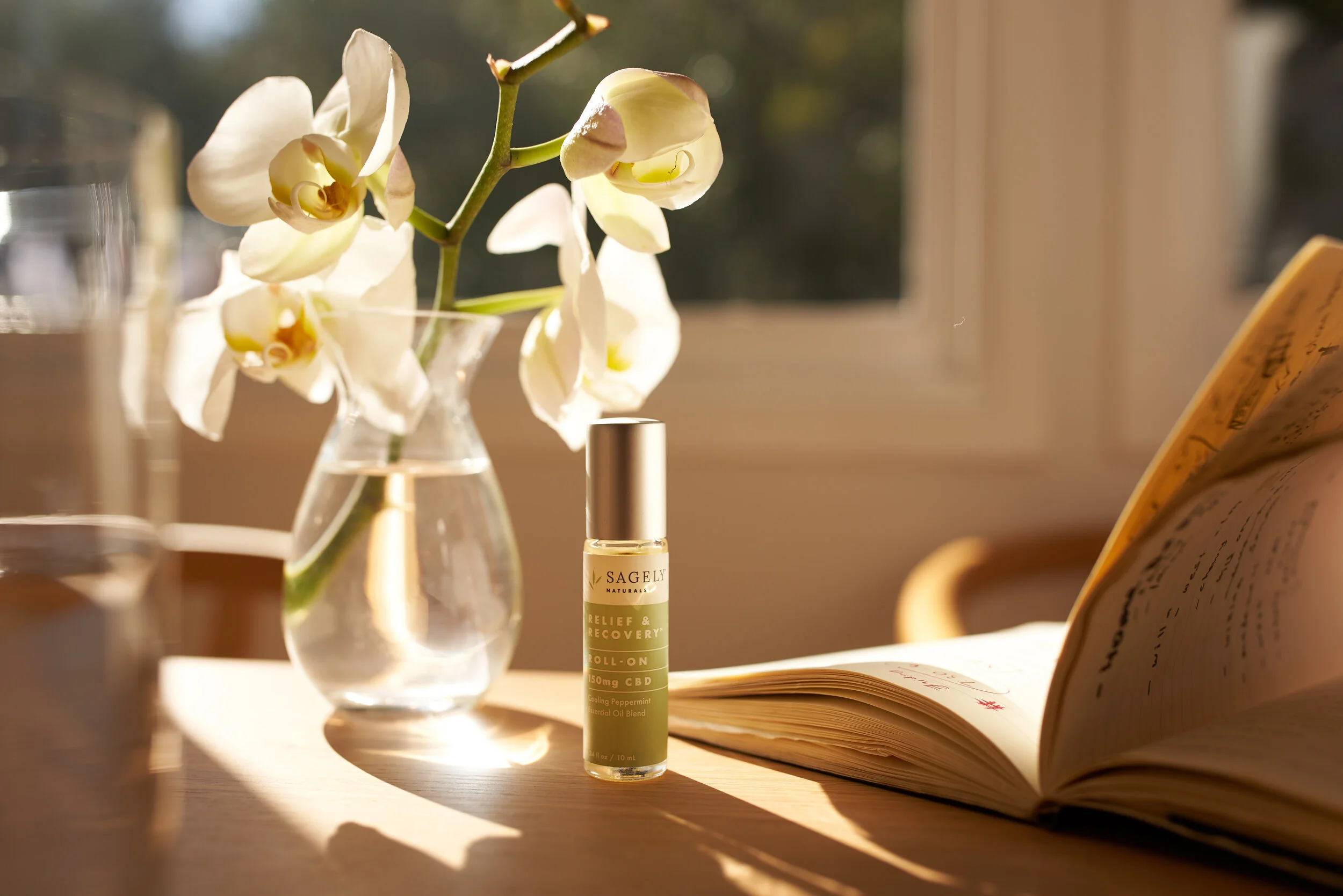
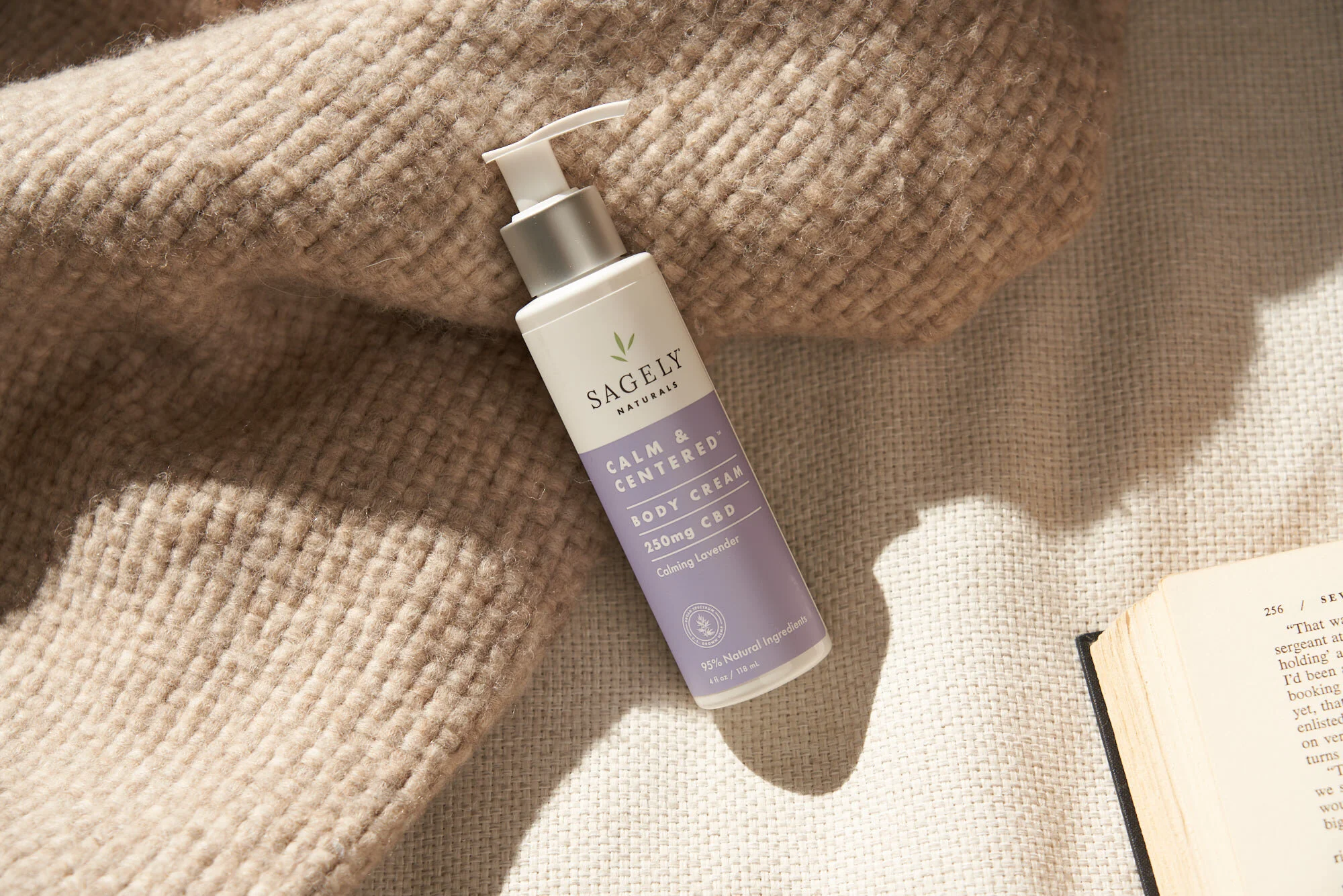
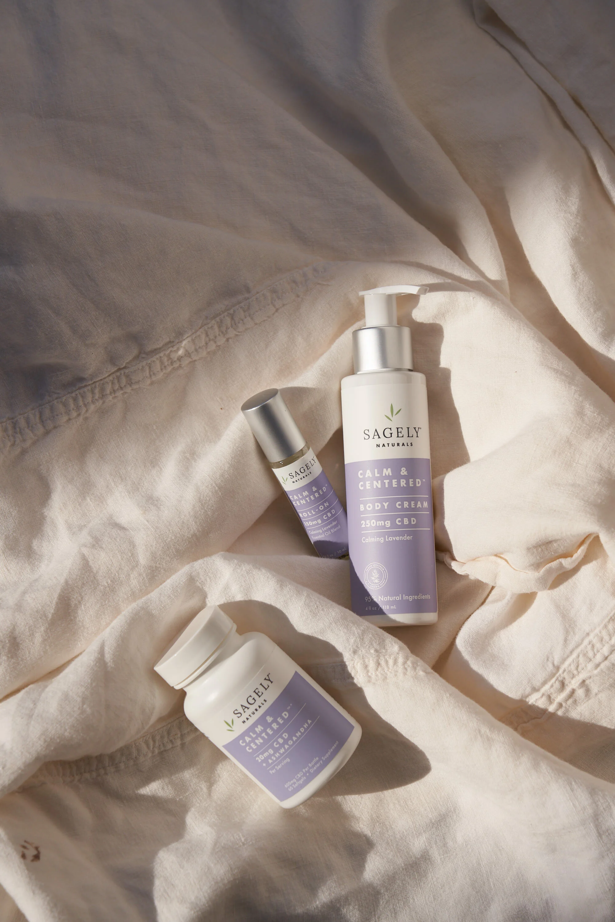
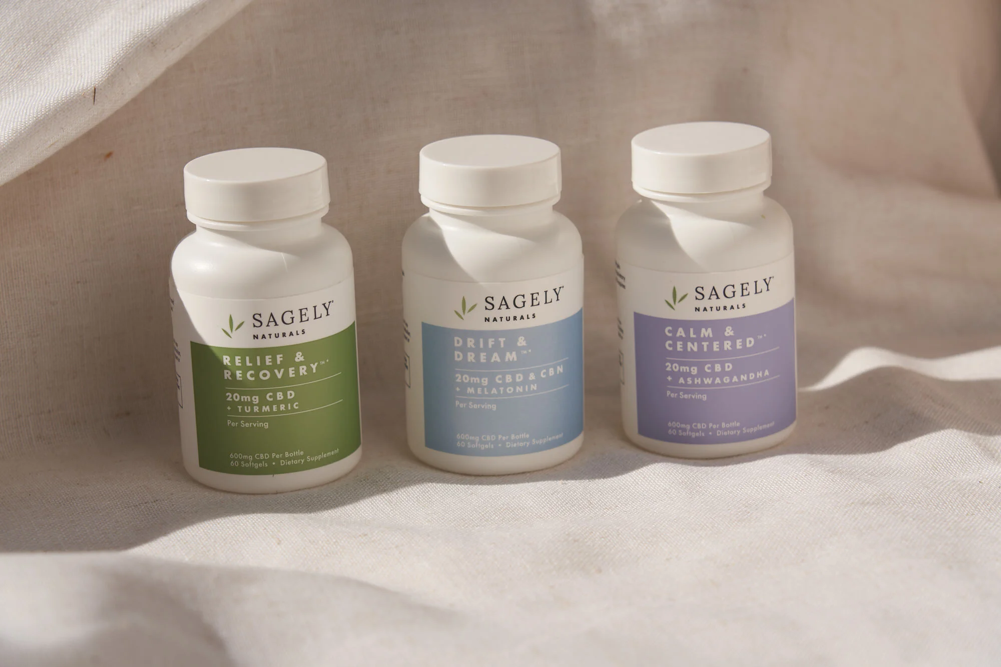
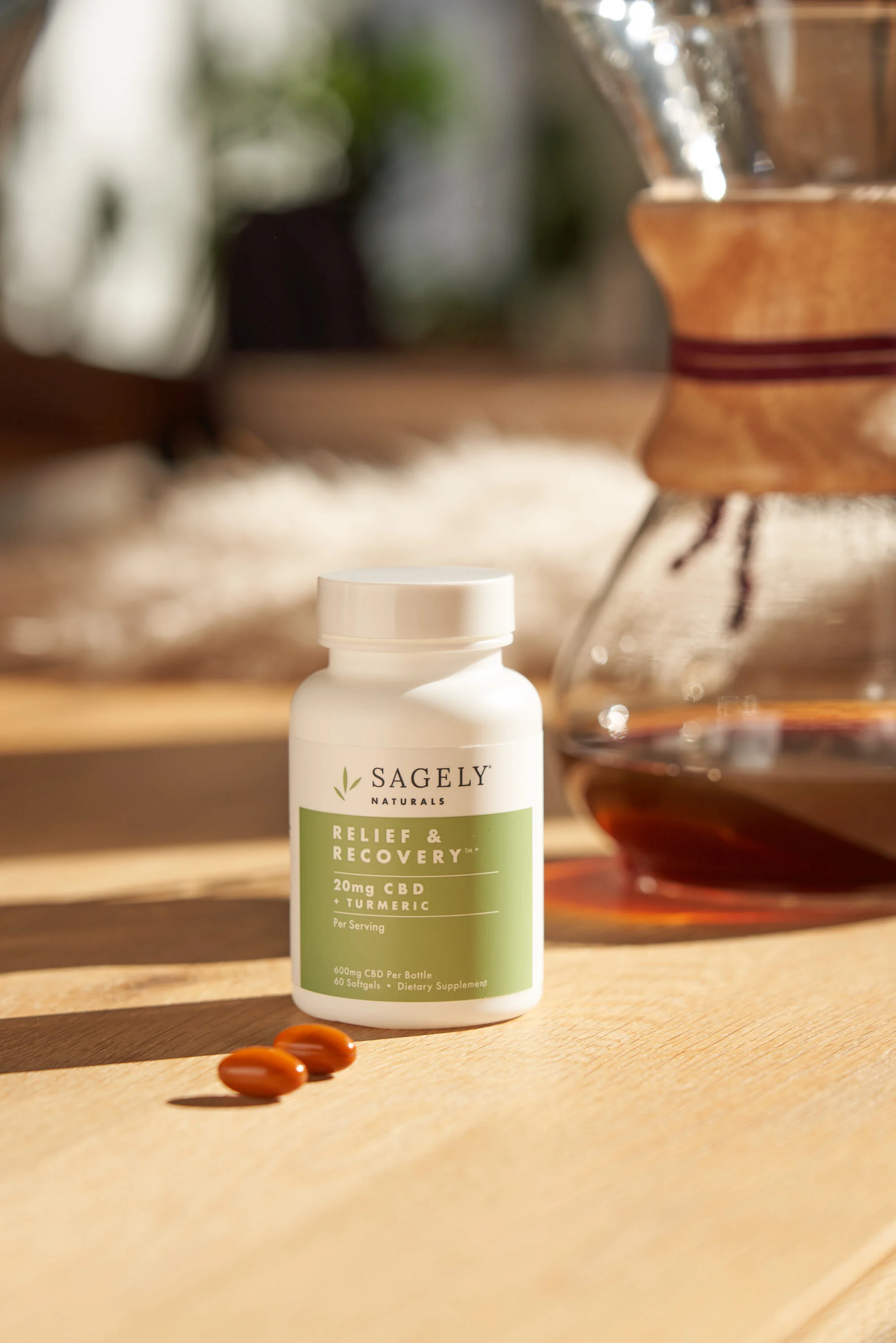
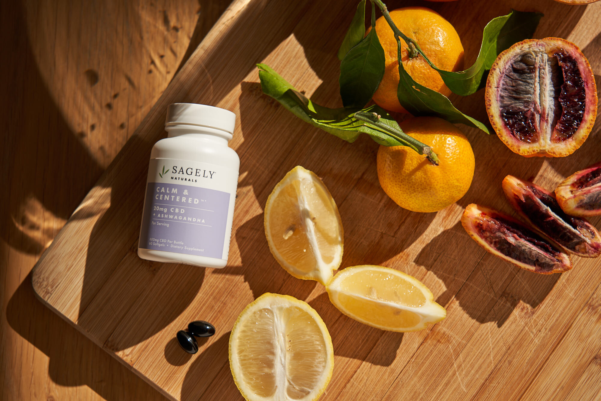
Through endless rounds of brand audits, competitive analysis, and designs. The new look and feel is an evolution of the original design but takes the key elements that may feel clinical to a more eye-catching level. The new product pops on shelf and is differentiated from its competitors with a sleek look while retaining its original clinical aesthetic.